FRI-01-12-2023
Advertising and Marketing
L/O- To explore the aims and conventions of print advertising
- What is the main aim of advertising?
- To bring attention to a product, service or issues
-Global industry which provides a major source of income to other media industries
-We encounter it in many different forms at all times of the day. Advertising campaigns often utilize a mixture of media forms– print, TV, radio and digital
-All adverts aim to communicate a clear message about the product, service or issue
-Depending on the type of campaign, it might also:
-Raise awareness
-Inform or educate
-Persuade audiences
-Create a unique selling point

This campaign raises awareness of the war in Syria and hows it's effecting the children there

This campaign informs/educates people about mental health and how they can reach out for help

This campaign persuades audiences by saying that their services can come to them instead of the audience coming to them. This may easily persuade elderly people.

This campaign has a unique selling point compared to other shampoo brands since they're 100% dandruff free
WED-06-12-2023
Advertising & Marketing
L/O- To explore the codes & conventions of print advertising
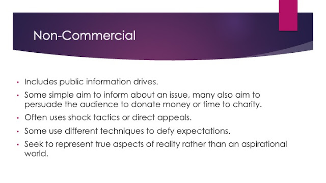
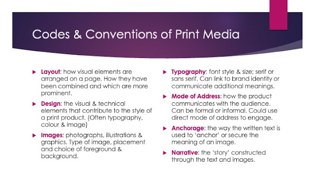
"Codes & Conventions"
The expected elements that will be included in products from a particular media forms and genres
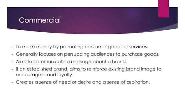
–COMMERCIAL AD !
-the main aim of this advert if for people to buy the shoes
-the way they've communicated that was through saying 'the sneaker makes the man'
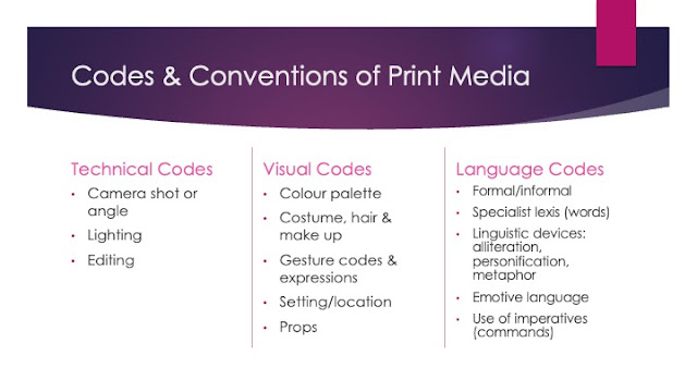
-they've used mainly language codes to present what they're promoting in the ad
-hard sell
–NON COMMERCIAL AD !

-the main aim of this advert is to make awareness of child poverty
-the way they've communicated this was through the anchorage by saying 'poverty knows no age' and also through the main image.
-they've used visual and language codes to present what they're talking about in the ad
for print advertising the product is most likely to include;
-name of brand/product
-logo
-slogan
-specific details of USP/product or service
-hard/soft sell

1- imperatives
-repetition
2-wordplay
-alliteration
3-wordplay
–INTERTEXTUALITY
–modern adverts usually make references to other media products, perhaps from other media forms or genres, that audiences can identify
–this helps communicate a message quickly and memorably
___________________________________________________________________________________
FRI-08-12-2023
Historical Advertisements
L/O- To explore historical advertisements and their codes and conventions

WED-13-12-2023
Historical Advert Set Text
L/O- To explore the context & content of historical set text
DO NOW-

1- they've made it so females seem more family-oriented and men are more interested in the car itself
2- they said "for her" followed along with more 'feminine' reasons to own a car and then they said "for him" followed along with more 'masculine' reasons to own a car
3- family friendly, comfortable, anybody could afford it
4-
HISTORICAL CONTEXT-
- the icons of the quality street brand were two characters from regency era of British history. in the regency era, Britain went through a period of elegance with fine art and architecture
-the regency era could also be compared to the 1950s for it's significance social and cultural development. between 1811 and 1837 the country was under the rule of prince regent and developments in technology, fashion and architecture.
SOCIAL CONTEXT-
-the 1950s saw a change in high culture, a time where fine art decadence and theatre that had previously only been accessed by wealthy people and upper classes.
-the conservative party's 1951 election campaign was spearheaded by the slogan 'set the people free'
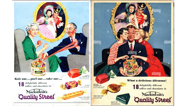
structure and design- they've made it so the writings below the image making it so the first thing the reader sees is the image, they've include the mascots/brand identity Miss Sweetly and Major Quality in the ad, everyone in the ad is looking at the sweets. the anchorage of the gold frame- connotations of a effect around the man and the product. typical triangular geometric composition od the poster to help secondary anchorage of the product. product takes central framing
typography- the serif font makes it seem more elegant but the '18' and 'Quality Street' are sans serif, they have a purple logo. it is strong, forming the bottom third of the poster, and the strong purple colour stands out to draw the customers attention
persuasive language techniques- repetition with the words 'delicious', 'toffee' and 'chocolate', they also include alliteration with the text 'delicious dilemma'
connotations- the colour purple connotes to royalty and luxury and it also links to the brand identity. connotations of the females dressed like the sweets that are shown close-up on the bottom third of the poster
dilemma- which of the women he wants or which of the sweets he wants. the inference of the dilemma can be investigated at two levels; male 'hero' choosing between two 'damsels in distress'(Propp's theory), females choosing the chocolate.
class- they seem more upper/higher class and richer society
___________________________________________________________________________________
WED-10-01-24
Historical Advert Set Text
L/O- To explore the context & representations in historical set text
DO NOW-
1- the man looks like he's upper class/wealthy, the two women are dressed to look like the chocolates
2- upper class or more of a privileged lifestyle, since they can afford more luxuries
3- that Quality Street chocolates are more of a luxury item
-the 1950s saw a change in high culture, where entertainment and arts became more accessible and affordable for everyone
-the post war culture of strict rationing and state control was coming to an end, and the new government set to increase individual freedom
AD 1 -
-making it seem like women are meant to/it's their purpose to clean
-its most likely aimed at men so they'll purchase the hoover for their partner, since they make all the money
AD 2 -
-the advert makes it seem that women are meant to cook for their husbands/other people.
-the advert is most likely made to be aimed at men since they make the money
AD 3 -
-the man laid back and sitting down whilst the women is actually up and doing things/looking after the children. the young boy is playing about meanwhile the young girl is seemingly serving them the ice cream.
AD 4 -
- the fact they used 'her' is objectifying women
AD 5 -
-that women are meant to work for men and are meant to be submitting to them
AD 6 -
-it's suggesting that women are clumsy and can't do anything right/isn't capable of doing a simple task. the man has the power in the household
Gender roles in the 50's are VERY stereotypical and patriarchal, the men would go out and work (shown by them wearing suits) whilst the women would typically stay home, cook, clean and look after the children. This was a drastic change from the 40's, when they were doing all the mans job while they were off fighting in the war, because they dressed in trousers and jeans and then in the 50's they became a lot more feminine– wearing dresses and thing like that. The men typically had all the power in/outside of the household, that's shown in the media by all these ads objectifying the women/making them a 'damsel in distress'.
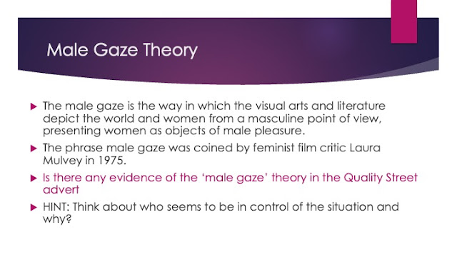
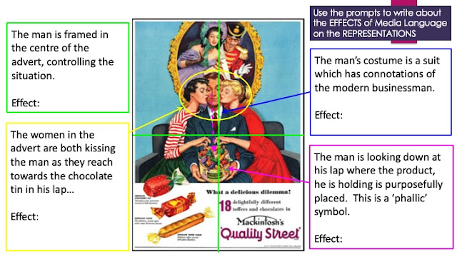
-the man is made to have all the power, him being the centre of the ad makes it seem like he's the more dominant figure.
-the man wearing the suit probably links to the fact the men go out and make the money, therefore the reason he's dressed like a businessman would.
-the phallic symbol, the man looking down at his lap, also links to dominance and power along with control of the situation.
-the women are being objectified as they are dressed like that sweets, making it seem the choice between the two women is just as easy a picking out a chocolate. also the fact that the woman are reaching down to the tin in his lap links into the phallic symbol.
___________________________________________________________________________________
FRI-12-01-24
Historical advert set text
L/O- To explore the possible exam style questions for advertising
DO NOW-
- male is the more dominant gender
- he's in the centre of the ad therefore is the first thing the audience sees
+ the phallic symbol also relates to dominance and control of the situation
+ he's wearing more formal attire than the females
Quality Street advert exam question
The interaction between the male and female characters is significant because the ad is primarily focused on the male gender. For example, the man is centre fold in the ad therefore is the first thing the audience sees when they look at it. There are also phallic symbols in the ad, on of them is the fact the man is staring down at the chocolate tin in his lap. Phallic symbols normally prove male dominance and that is seen in this Quality Street ad. He is also dressed in more formal attire compared to the females, proving he is probably more significant and of a higher class.
On the other hand, the females are less significant in the ad. For example, they are dressed to look more like the chocolates therefore objectifying them. They are also dressed to seem like a lower class then the man, proving the male dominance even more. The connotations of the women being dressed like the chocolates makes it seem like the choice between the two of them is just as easy as picking out a sweet, making it seem a little demeaning in a way.
___________________________________________________________________________________
WES-17-01-24
Analysing Adverts
L/O- To build the skills needed to analyse and evaluate adverts
DO NOW-
- CONNOTATION– when someone/something is implying another thing
- DENOTATION– is what it actually is
AD 1 –
- the UK guards make the fact the broadband is safe and protected emphasised
- the neon colours have connotations of the internet and stuff being online
AD 2 –
- ironic, very suggestive
- the colours connote to passion, romance and desire
- the big mac is being compared to a woman
AD 3 –
- suggesting that the Audi R8 is as fast as a race car yet you can still drive it on the road
- the number 1's on the side of the older models suggest that they're the best
AD 4 –
- suggesting that no matter how strong and 'manly' you are you can still used bandaids like the hulk
positive
- inquisitive, interested, curious, disabled
negative
-crippled, handicapped, retarded, nosy
___________________________________________________________________________________
HOMEWORK 19/01/24
The Quality Street ad uses images to create meaning by putting the man in a suit. The suit may have connotations to men being mostly businessmen in the 50's and the providers for their families instead of the women, making them the more dominant figure. Also having the man dress in a suit may make it seem having the Quality Street chocolates is a luxury. The two women shown in this ad are dressed to look like the chocolates making it seem they are being objectified or being compared to the chocolates.
The language used in the ad suggests there is a dilemma, stated in the heading 'What a delicious dilemma?'. This may be linking to the image as the man looks like he's picking out a chocolate, or it could be suggesting that the real dilemma is picking between the two women making it seem like picking between them is as easy as picking out a sweet.
The layout and design of the Quality Street advert has put the male centre fold in the ad therefore making him the first thing the audience sees when they look at it. That fact they have done this makes the male a more powerful and dominant figure in the ad, especially with the two females beside him kissing his cheek. Also having the text below the image will make it so the image is the thing the audience immediately sees (as well as the man).
___________________________________________________________________________________
FRI-19-01-24
Persuasion in Adverts
L/O- To build the skills needed to analyse and evaluate adverts
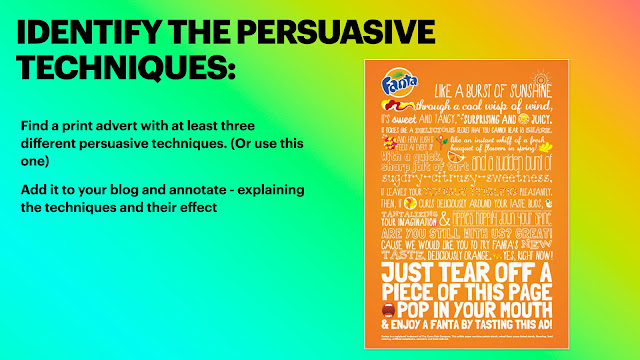
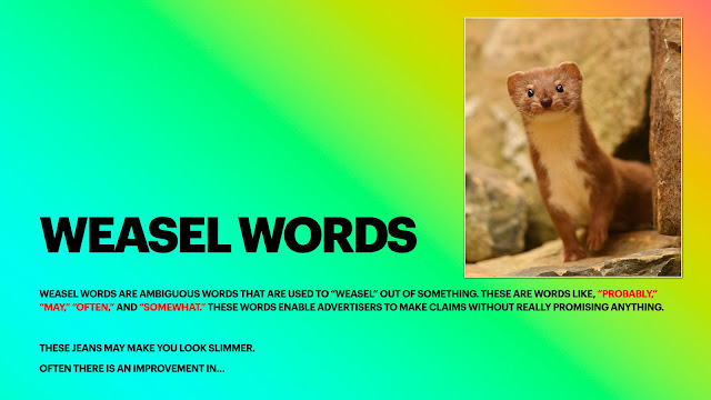
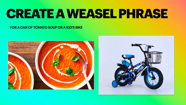
using this bike may change the the way you travel forever
–new teen fashion brand (made on canva)
WED-24-01-24
Contemporary Adverts
L/O- To understand the techniques used in contemporary adverts
DO NOW-
patriarchy
MALE- blue, more masculine and strong, brave, tough, smarter
FEMALE- pink, feminine and a 'damsel in distress', shy, polite, housewives
males are shown to less 'emotional' than women
THE BRAND IDENTITY OF FIAT
–light-hearted, cheerful, an affordable but good car, they've got something for everybody, bubbly
– in the FIAT ad the intertextual references is that it sounds like its a fashion magazine when it says spring/summer collection
– the media language used relates to an old school sort of vibe e.g. the bright colour palette. Also the colours of the cars in each of the ads are slightly stereotypical, since red is known as more of a masculine colour and yellow more of a feminine one. FIAT has also used the Z layout, the audience would see the small text first then the large text, the car and then the FIAT logo (making a Z shape)
HOMEWORK ON THE MEDIA BLOG!!
___________________________________________________________________________________
FRI-26-01-24
Creating Adverts
L/O- To use our understanding of advert connotations to create advertisements
DO NOW-
–one main image
–logo
–slogan
–the product
–anchorage text/persuasive text


why hold it when you can wear it? –umbrella hat
why let your dip slip, when you can have a dip clip?–a car dip holder
your chicken might not run away forever when wearing this epic harness. –chicken harness
Adam Sandler–finger covers for Cheetos
___________________________________________________________________________________
HOMEWORK 31-01-24
This Girl Can-
1- sport England developed This Girl Can, it was launched to celebrate a realistic vision of women
2- the target audience is any and all women
3- it was launched in 2015
4- it's mission is to tackle the gender activity gap/to change the way women think and feel about exercise
5- its funded by the national lottery

___________________________________________________________________________________
WED-31-01-24
Women In Advertising
L/O- To evaluate how women are represented in a verity of adverts, so that we can apply this to the set text for the exam
DO NOW-
this data shows that, in conclusion, most girls are less confident in sport/trying new things than boys. most girls aren't interested in watching or following sports on TV and are less interested in sports outside of school.
THIS GIRL CAN–
-it was launched in 2016.
-developed by sport England and funded by the national lottery–there was no intention in making any money.
- the purpose of the campaign was to break down the primary barrier holding women back from participating in sports–fear of judgement.
-before the campaign, research showed that there was a massive gender gap between men and women participating in sport, with two million fewer 14-40 year old women than men partaking in regular sport.
-13 million women said they'd like to participate in sport more.
-just over 6 million of those women weren't active at all.
-as a result of this campaign, 1.6 million women has started exercising and the number of women playing sport and being active is increasing faster than men.
MANTRA–a statement or slogan repeated frequently


the message that these convey is that women can still enjoy sports AND enjoy feminine things(shown in the first ad i've picked). These ads so that women don't have to live by stereotypes and can do whatever they want to.
AD 1 (NIKE)––
-The advert is focusing on the strength of the woman
AD 2 (NIKE)––
-this advert is setting a mood for encouraging women to be more active amd to reach their full potential and making women look athletic with the use of women
AD 3 (ADIDAS)––
-this ad is representing women or the woman in particular to be good at what they do
all of them are making women be represented as strong in their adverts
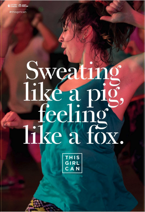
the difference between the Nike and the Adidas ads and this one is that those ones are more aesthetically pleasing, since they aren't sweating or looking like they're necessarily enjoying themselves. Meanwhile, in the 'This Girl Can' ad, the woman look like she's trying her hardest and is actually enjoying herself. The text 'SWEATING LIKE A PIG, FEELING LIKE A FOX' says that even though she's working out and sweating a lot she still feels attractive/confident with herself and that it doesn't matter if she's becoming sweaty due to what she's doing, she feels confident and it doesn't matter what people think about her.
___________________________________________________________________________________
FRI-02-02-24
Advertising set text #2
L/O- to analyse the construction of the this girl can set text
DO NOW-
this advert targets a wider range of women than the 'THIS GIRL CAN' print poster because it's included a wider range of body types, ethnicities, age range, disabilities since its easier to do so in a video and not a print poster
'SWEAT'
-gross -active
-smells
'PIG'
-dirty -
-loud
'FOX'
-cunning -
-used to call someone attractive
The This Girl Can campaign used the phrase 'SWEATING LIKE A PIG, FEELING LIKE A FOX' in a way where they've made it seem positive. The message they're getting across is that even though you sweating a lot and stuff you'll feel great while doing so and afterwards too.
they've used the serif font because it's more of a feminine looking font and also if they used a big and blocky font like sans serif you wouldn't be able to see much of the image behind it.
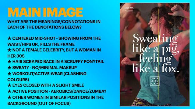
the fact they've used a woman in her 30's that doesn't necessarily have a body type like an athletes is presenting the fact that ANY woman can work out/exercise, since this ad is about real women, every women and not just females that are already thin and are famous. Also the fact her clothes are clashing makes her more real, more relatable than a celebrity can portray.
two similarities and two differences between the quality street ad and this girl can
similarities
-they both have the use of serif fonts
-
differences
- the quality street ad doesn't focus on the females in the main image they focus on the man instead, but the This Girl Can one focuses on the female (since she's the main focus and thats their target audience).
-the women in the quality street ad are shown to be neat and dressed in girly things but in the This Girl Can one she's sweaty and being active.
___________________________________________________________________________________
WED-07-02-24
representation & theory
L/O- To explore the representations in set text and apply relevant theory
DO NOW-
- the intention of the This Girl Can campaign is to change the way women think about exercise/sports

dominant ideology in the UK–
dominant ideology in Cornwall–
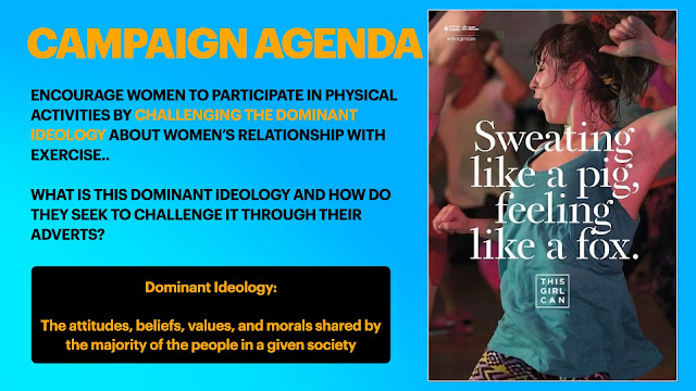
the dominant ideology is that women can't be active or participate in sports without being judged, the way This Girl Can challenges that is the way they present the women in their adverts to being enjoying themselves or being confident in themselves in ways women exercising probably wouldn't.

no, it's not
___________________________________________________________________________________
FRI-09-02-24
C1 Section A PPE
L/O- To practice how to answer exam style questions effectively
DO NOW-
–confidence, enjoyment and relatable.
+ empowered
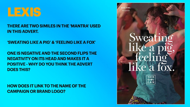
question 1– THIS GIRL CAN
-explore how the print ad for THIS GIRL CAN uses media language to create meanings
a- (text/written language–lexis)
L/O- To revise how to answer exam style questions effectively
PPE Q1a: 4/5
WWW: Excellent points well explained and supported
EBI - link the second point to the meaning/purpose of the campaign.
PPE Q1b:6/10
WWW: good focus on the meanings constructed by the visual codes
EBI: make sure you include the connotations and link the points to the meaning/purpose of the campaign (use the DEL structure)
DEL STRUCTURE–
D– DESCRIBE; the meaning constructed
E– EXPLAIN; support with specific evidence- how has media language been used to construct this meaning (connotations)
L–
2 (a) explain how political contexts influence magazines.
_____________________________________________________________________________________
HOMEWORK
Explain how SOCIAL & CULTURAL context has influenced advertising. Refer to the This Girl Can advert to support your points. [5]
This girl can has influenced advertising socially due to its ability to use real women to promote their campaign. The fact that they didn’t use a stereotypically fit woman in the ad has defied social norms and what people expect from sporty advertisements like This Girl Can. This shows that anybody, no matter what background, age, or body type can be engaged and involved with exercise and sports—crushing the painful stereotypes that have discouraged people in the past.



CONTEXT HWK #2
ReplyDeleteExcellent - well done! A bit brief though