WED-06-09-2023
L/O- To explore the concept of representation and stereotypes
Introduction To Media Representations
Representation
-The media offers the audience an interpretation of the world.
-It is a RE PRESENTATION of the events, people and places.
the representation in this is positive because it show different types of disabilities and is representing them well. Also the use of the word 'Superhuman' is showing it in a more positive light.
- determined -focused
-strong -powerful
-brave
DO NOW-
-positive representations of teenagers in media
-Miles Morales (Spider-Man: Into The Spider-Verse)
-Ellie Williams (The Last Of Us)
Ghostbusters Afterlife MES (Phoebe & Podcast)-
- they are introverted, socially awkward AND physically awkward, lack of fashion also both of them have their shirts tucked in, glasses, slightly messy hair, Phoebe's more of a stereotypical nerd and Podcast is more of a nerd in a tech-y way
- Nanny - usually Hispanic/Latina, older/middle-aged, female, caring and friendly,
- Nurse - mainly females, younger adults, blue scrubs,
- Teenager - moody, anti-social, gets into trouble a lot, quiet,
- Astronaut - male, physically fit,
- Football player - male, teenagers/young adults, athletic, confident, physically fit,
- Opera fan - wealthy, snobby, intelligent, older,
- Teacher - either stern and bossy or not bothered, usually the male teachers are more of the strict ones and the female teachers are more sweet and understanding,
- Tattoo lover - more of a troublemaker/criminal, has like an emo or gothic fashion sense, quiet and cold,
this advert challenges stereotypes by showing that even though a man is a nurse doesn't mean that they're any less of a man. but also its saying that some males may be embarrassed or made fun of for being a nurse most likely why the ad has text saying 'Are you man enough'.
Educating the east end
- some of the students are miss behaving and talking back to the teachers
- other students are sweet and have a good relationship with the teachers, are intelligent and celebrate their success
- teachers are represented as professional in the way they dress and speak
- teachers are also sweet and telling the students that they are proud of them
FRI-15-09-2023
Representations in magazines
L/O- To explain the representations found in magazines
differences-
- both have different colour palettes - they use the stereotypical male/female colour palettes
- target audience - male and female
- star vehicle - theres a female star vehicle for females/male star vehicle for males
- masthead - one is in front and the other is behind
- shot type -
The difference between the way gender in both magazines has been represented the star vehicle because they are both represented in a more stereotypical way for their gender since in cosmopolitan they're talking about loosing weight, confidence and she's more objectified and then in GQ
1- colour palette
2- anti-stereotypical male star vehicle
WED-20-09-2023
Exam style magazine question
L/O- To write and structure an effective exam style answer
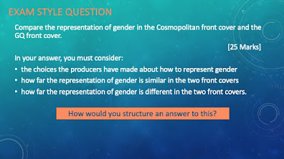

The two covers represent gender very differently, in Cosmopolitan they represent Tom Daley in an anti-stereotypical way. For example he's been styled in a more feminine clothing, both in colour and style, however as a gay man this may be MORE stereotypical. On the other hand, there are more stereotypically masculine representations with the tattoo and the muscular build he has. You could also say that some of the topics that the magazines cover lines are talking about is anti-stereotypical some of them being jobs and porn.
In GQ the cover star, Rihanna, has been portrayed in a more stereotypical way than Tom Daley has in Cosmopolitan, although you could say it's anti-stereotypical for this exact magazine, GQ. Since she's seemingly been sexualized on the cover of a mens lifestyle magazine with her being naked on the front cover, they could also be doing this for the male gaze. You could also say she's being represented in a more negative way due to the way she's styled to look like Medusa and that could be presenting women in a more negative light, however it could be representing power in some way. Despite having a female cover star, the magazine still talks about more masculine topics; Tech, status, 'man moments' and 'new man'.
Gender is represented fairly differently in both magazines, Cosmopolitan being less stereotypical than GQ due to there being a few things that may be classed as more 'masculine' on the front cover of a more female targeted magazine. Unlike Cosmopolitan, GQ kept the same masculine topics and only used a female star vehicle, that also feeds the male gaze theory.
FRI-29-09-2023
Exam style magazine question
L/O- To review & improve an effective exam style answer
WED-04-10-2023
Industry Research
L/O- To research companies linked to set products
VOGUE
1- vogue was first launched in 1892
2- Vogues target audience is mainly women
3- Conde Nast is the publisher
4- its multi-platform (print and digital)
5- circulation (2022) - 190,249 and the readership (2022) is 796k
6- their target audience in pro dominantly women
GQ
1- it was first launched in 1931
2- the original genre is mens style and culture
3-
4- Conde Nast is the publisher
5- it is multi platform (print and digital)
6-
7- the target audience is men
circulation- the number of newspaper/magazine copies distributed on average in a day
advertising- the activity or profession of producing advertisements for commercial products or services
cover price- price of a newspaper or magazine
subscription model- a fee customers pay on a regular basis to get access to your product
multi-platform- capable of running on two or more different hardware platforms (print or digital)
readership- the number or type of people who read it
ideology- a set of opinions or beliefs of a group or an individual
brand identity- the visible elements of a brand such as colour, design or logo the identity and distinguish the brand in consumers minds
target audience- a group of people who are most likely to be interested in your product or service
HOMEWORK #1-
Gender has been represented in a less stereotypical way in this GQ magazine through the cover star, Tyler, The Creator. For example, there isn't much talk of "manly" topics or topics about men in the cover lines, for example it says 'chaos at the top of mount Everest', although it's the 'men of the year issue'. Tyler has also got more of a gender neutral colour palette opposed to most of the other colour palettes GQ has used for other covers, also the jewelry could be more of a feminine aspect to the way he's been styled. Since he's bisexual, there also could be a slight chance that GQ has chosen this style to show that in some way.
WED-11-10-2023
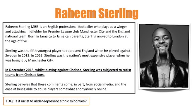
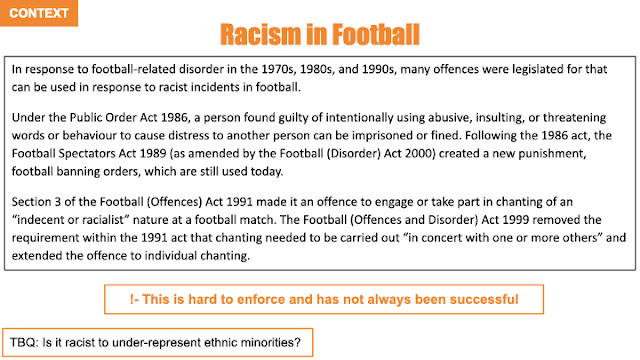
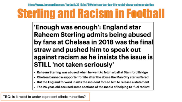
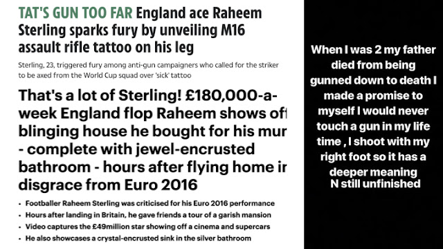
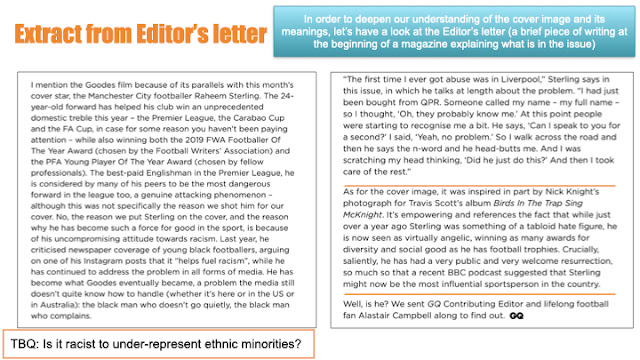
Case Study #1 - Raheem Sterling
L/O- to explore the context & cover star for case study #1
DO NOW-
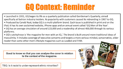
1- GQ- masculine, posh, sophisticated
2- VOGUE- feminine, empowering, modern
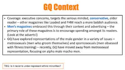
1) Jennifer Lopez has been sexualised on the cover of GQ and David Beckham has not
2)GQ targets their audience, which is male, by putting masculine topics for the cover lines and occasionally placing sexualised women on the front cover
3)
FRI-13-10-2023
Typography-
-anything to do with the text e.g. font, size, colour, capitals/lowercase,
In this cover of GQ, there is a variation of typography used. theres a mixture of serif and san serif, sans serif has been used for the masthead and most of the cover lines meanwhile serif has been used to highlight a few words.
colour palette-
-usually 3 or 4 colours, sometimes has an accent colour
In this cover of GQ, there is a set colour palette of white, beige, black and a sage green. The colour palette may link to a cover line that says '99 ways to look cool this autumn' because this particular magazine was released in September/the beginning of autumn, so the colour palette may reflect that.
Z layout-
-a Z-pattern design traces the route the human eye travels when they read – right to left and top to bottom
In this cover of GQ, the layout follows the 'L layout', but sometimes other covers will use the Z-pattern.
anchorage-
-in the same way a word can have more than one meaning, it is possible for signs to have different meanings, so producers will try to direct the audiences interpretation towards a preferred reading of a media tex
t by using anchorage.
-in newspapers and magazines, photographs are often accompanied by captions which are used to fix their meaning
In this cover of GQ, the anchorage is 'rock'n' roll star 72 extraordinary hours with Liam Gallaghar'
03-11-2023
exam question
explore how this front cover of GQ magazine uses media language to communicate meanings
image-
This cover of GQ uses media language to communicate meanings, for example, the main cover line 'Guardian Angel' could emphasise the star vehicle, Raheem Sterling's religious views or the fact that he plays as the winger in football. Also, the fact that Sterling is showing off his tattoos a lot in this front cover may show that even though he was harassed online about his leg tattoo, although not seen in this GQ cover, may show people that he's proud of them and isn't afraid to show them off. The way Sterling was posed could be a way of showing his confidence and power, this pose/stance also brings attention to his legs and feet which is his best asset, since he is a football player; but also it could bring attention to his muscular physique. The shot is a low angle long shot, making him seem more intimidating.
text/written language-
The cover line "Speak No Evil', could link towards racist remarks or slurs that have been said to him and other black people in the media. (25 min NF)
WED-08-11-2023
movies that represent black stereotypes-
scary movie 1 & 3
Jumanji
ride along 1 and 2
8 mile
green mile
he's shirtless/ showing off his muscular physique
he's also showing off his tattoos which is more masculine
his pose is more masculine and confident
large chains/ jewellery
showing off his tattoos
showing off his physical strength
the angle of the shot, a low angled long shot, makes him seem intimidating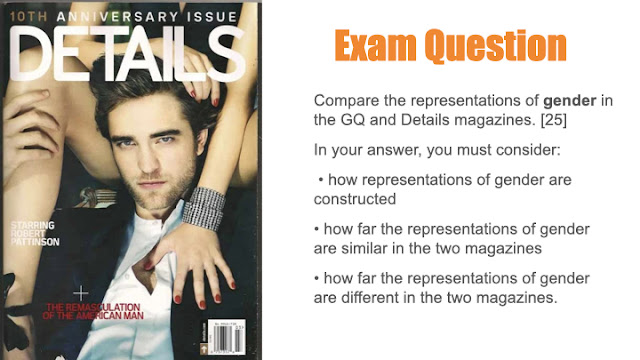
the cover line 'the remasculation of the American man'
he's in between a woman's legs
he's in a masculine pose
FRI-08-09-2023
WED-15-11-2023
DO NOW-
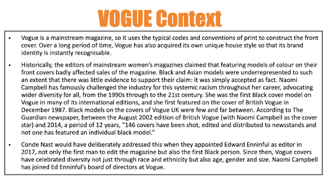
-Condé Nast is the publisher
-the target audience is mainly women
-it's a fashion and lifestyle magazine
-it's a multi-platform magazine
CASE STUDY #2 - Malala Yousafzai
L/O- To explore the context & cover star for case study 2
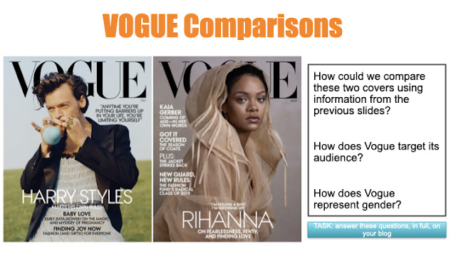
- in the two covers, Vogue has used anti-stereotypical star vehicles. since Rhianna is a person of colour and Harry Styles has a more feminine approach with the way he dresses and he's a man.
-
facts about Malala Yousafzai
-in 2012, when she was 15, she was shot by the Taliban while riding a bus home
-she's written multiple books
-she won a Nobel peace prize at age 17
-
Homework #3-
In these two different covers, gender is represented similarly. In the GQ cover with the star vehicle, Raheem Sterling, gender has been through the shot angle and stance, which is a low angled long shot, since it makes him seem more masculine. Also, the shot type makes it seem as if he were looking down at you, making seem intimidating in a way. Sterling's stance shows confidence, making the way he's posed even more masculine. In the Details cover the star vehicle, Robert Pattinson, has also been posed in a fairly masculine way. With him being in-between a women's legs could point towards it being masculine and the way he's looking directly into the camera could do that too.
WED-22-11-2023
L/O- To explore the representations in case study #2
DO NOW-
- colour palette
- camera shot
- direct address
homework #4-
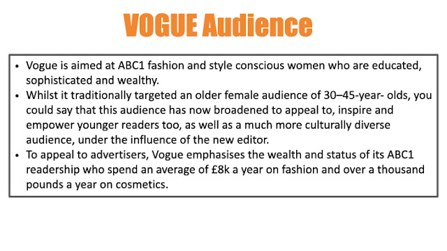
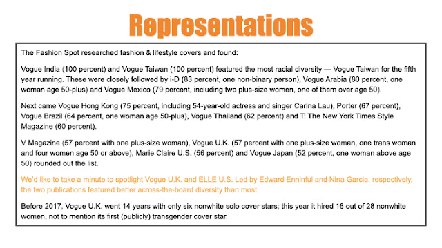
vogue has shown more diversity with age, size, gender and ethnicity
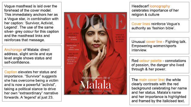
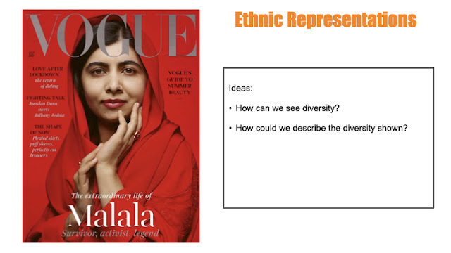
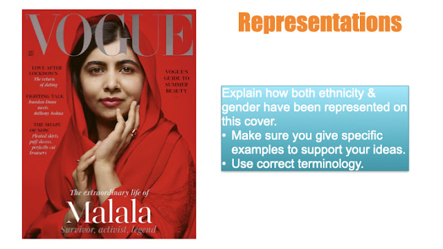
- we can see diversity by the cover lines, including black peoples names in them. Also, the use as Malala herself, a muslim woman, as the cover star is anti stereotypical for Vogue.
- most of the cover lines on this cover are stereotypical, talking about love/dating and fashion. but also, theres mentions of Anthony Joshua which steers away from the stereotypes.
- Malala looks very feminine - the silk headdress, jewellery and makeup
- the 'fighting talk' cover line - challenges stereotypes as shows women being strong, interested in male sports
-Malala anchorage - depicts strong, powerful and confident women.
- 'survivor' - anti stereotypical shows her as not a victim.
DEL-
D- describe. describe the technique/element/representation used.
E- explain. explain the connotations/meanings constructed.
L- link. link to the overall context/meaning.
representation-
In this cover of Vogue, there is representations of gender and ethnicity. The cover star, Malala, has been represented as a strong and confident woman. That is shown through the colour palette, the colour red being powerful and filled with passion. Also, the cover line 'FIGHTING TALK' challenges stereotypes and shows that woman can be interested in male dominant sports. The fact that the cover call Malala a 'survivor' is also anti stereotypical, since in most contexts muslim women are represented as a victim and not a survivor. Also the fact that Malala herself, a muslim woman, as the cover star of Vogue is a representation of muslim women in the media and is showing people that they aren't like the stereotypes people have made.
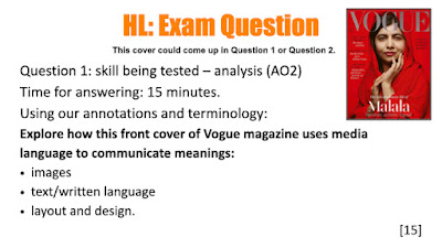
In this cover of Vogue, it uses media language to communicate meaning. For example, it use the colour palette of mainly red to show her power and passion, as that colour represents those sort of things. Also, in the caption, Malala is called a 'survivor' rather than a victim, since most Muslim women are represented as timid and shy, but Malala is being presented as strong and resilient. The anchorage shows her self-confidence and directly addresses the viewer.
WED-29-11-2023
L/O- to practice comparing representation in two covers
similarities / differences
-the Vogue cover in less stereotypical than the ELLE one
-their both showing confidence
-in the ELLE cover the colour palette is more stereotypically female than the Vogue one
-in the Vogue cover there is the cover line 'FIGHTING TALK' that is less stereotypical for a female target audience
-both shot types make them seem confident or intimidating
-in the cover lines of the ELLE magazine they're more stereotypically feminine
In the two covers, gender is represented in many different ways, the Vogue cover is less stereotypical and the ELLE cover is represented more stereotypically. Although, there is a few similarities between the two covers.
A similarity between the two covers is that they're both showing confidence. The way that it has been constructed is different in them, although, it has the same effect. In the Vogue cover, Malala has been presented as confident because of the direct address. The direct address towards the audience makes her seem slightly intimidating, although not in a bad way. Then, in the ELLE cover, Kim has been posed in way that makes her seem confident in herself. She isn't presented as 'intimidating' like Malala; but if you were to look at that cover you could tell that she's showing a lot of confidence. Also, the shot type makes them both seem powerful and/or confident, since the Vogue cover uses direct address and a medium close up shot you can see the confidence in her expression. In the cover with Kim, the shot type, a medium long shot, you can see the way she's posed is representing her confidence. Also, the ELLE cover is more sexualised than the Vogue one, since Kim is showing off more of her body and the shot is most likely made it look like that.
On the other hand, there is quite a few differences between them. For example, the cover lines on both the covers are very different. In the Vogue cover, the cover lines are less stereotypical, since the cover 'FIGHTING TALK' mentions Anthony Joshua. The fact they're talking about a boxer in a female lifestyle magazine most likely shows the fact that women can like/be interested in the same things as men. But, in the ELLE cover, it talks about makeup, e.g. 'THE BEST FOUNDATION IN THE WORLD', and it also has mentions of fashion. For example the cover line's 'HOW TO WEAR THE WINTER'S COOLEST TREND' and 'THE EASY LEATHER TROUSER'. The fact that the magazine talks about these things make it more stereotypically female.
Another difference between the two of them is that the colour palettes. In the Vogue cover, the colour palette, mainly consisting of red, shows passion about something. The fact the main colour palette shows passion links into the fact that Malala has a passion for women's rights to go to school. The colour red also represents power, that could tie into that Malala has been very successful from a young age, 17. But then, in the ELLE cover, the colour palette is fairly feminine including the colour pink. The colour pink on this cover has been used to highlight certain words, e.g. 'KIM' and 'CONFIDENCE', most likely wanting to make them stand out to the reader.
The main cover lines on both magazines are different. In the Vogue cover, the main cover line presents Malala as a 'SURVIVOR, ACTIVIST, LEGEND'. The way Malala has been shown as a survivor rather than a victim is very different to the way Muslim women are typically represented in the media. The main cover line for the ELLE cover is linking back into the confidence in the main image since it says 'THE SMART WOMENS GUIDE TO SELF-BELIEF' is most likely has a more feminine touch to it.
My overall judgement for these two covers is that they're fairly different, although they do have some similarities between them. The Vogue cover represented women in les stereotypical way and the ELLE cover represented women in a more stereotypical way.
VOGUE EXAM COMPARISON Q
18/25
Excellent work!
WWW: detailed and appropriate analysis of both products with accurate terminology and a clear judgement
EBI: Try linking your ideas to the magazine genre and







MAG REPRESENTATION EXAM Q:
ReplyDeleteWWW: you've compared both covers well and included gender stereotypes
EBI: include more specific examples in your answer
HOMEWORK - GQ COVER
ReplyDeleteGreat - some brilliant points but you don't really go into what they DO talk about in the cover lines that add to this less conventional representation of men.
GQ/VOGUE RESEARCH:
Good
GQ/RS RESEARCH & NOTES:
ReplyDeleteSome missing
GQ COVER ANALYSIS:
Great notes
GQ EXAM Q:
WWW: great points, well supported and linked to context
EBI: use more accurate magazine terminology & stereotypes
REP HWK:
ReplyDeleteA good comparison. Well done!
VOQUE COVER NOTES:
Excellent
VOGUE COVER MEDIA LANGUAGE:
Good ideas - lacks detail
VOQUE ML HWK:
WWW: Good ideas
EBI: You need more and specific examples explained for each idea
VOGUE REP NOTES:
Good
VOGUE EXAM COMPARISON Q
18/25
Excellent work!
WWW: detailed and appropriate analysis of both products with accurate terminology and a clear judgement
EBI: Try linking your ideas to the magazine genre and ideology