FRI-03-05-2024

FRONT COVER
- the main character (Jennifer Check/ Megan Fox), they've used a medium long shot making her seem almost intimidating
- the title is in front of the main image, its also using a sans serif font
- the tag line isn't on the DVD cover but it's on the poster being 'she's evil... and not just high school evil'
-the colour palette used is mainly dark colours, being red, grey, black and a little bit of white. the connotations of the colour palette could be red for the blood and black for the dark theme of the film
- there are the actresses names above the title
- there is only a sans serif font used but the title is quite large and the actresses names are quite small
- the genre is show through the dark atmosphere of the background and the blood on the main characters mouth
BACK COVER
- the two main characters (Jennifer/Megan Fox and Needy/Amanda Seyfried), and the shot used is
- there is three thumbnails used showing a scene where a bar got set on fire, Jennifers first on screen kill and the lead singer of a band (low shoulder)
- that something happened with Jennifer (the main character) and she's turned into/been possessed by a demon (succubus)
- by bringing in well known actors/actresses like Megan Fox and Amanda Seyfried, even Chris Pratt.
- it represents the genre by using the words like 'gore' and 'sinister demon', giving a general description of what the movie is going to be about. the movie is about a highschool cheerleader, Jennifer Check, that turns into a succubus and goes around eating boys (therefore killing them), and it's up to her best friend to try and stop her.
- the colour palette is very similar to the front, but it's more of a dulled down version– giving more of a greeny look. the connotations of this colour palette is that the movie is mainly in duller colours and that it shows the genre of the movie
- the credit block is located at the very bottom of the DVD, along with the producers logo (20th Century Fox).
- all text is in a sans serif font. the blurb is in a smaller size text
- not many stereotypes have been challenged, the main character/villain is a attractive popular girl in high school although she is the main threat in the movie
FINISH ANALYSIS!!
MAIN THEATRICAL POSTER
- the main character (Jennifer Check) is the main image of the poster, the shot used is a long shot showing her whole body
- the main character is in the middle of the poster being the main image, the main actresses names are placed at the top of it with the movies name+credit block at the bottom
-
- the title of the movie is placed at the bottom of the poster, the font used being a sans serif font
- a credit block is placed at the very bottom of the poster just below the movie title
- the colour palette used includes red and a series of green-y blacks/greys. the dark colour palette may have connotations to the demonic themes of the film and the colour red could link to blood and violence
- all fonts are a sans serif font however they do very in sizes
DVD FRONT COVER-
- the main image is one of the main characters brother who is attacked by the threat in the very beginning of the movie
- the title is basically in the very centre of the image
- the tag line isn't of the DVD cover but it's on the poster instead being 'you'll float too'
- the colour palette consists of yellow, red and black + a tiny bit of a lightish grey. the colour yellow is a more childish colour being bright and happy but contrasting it with the black and red, red connoting blood, violence and gore, makes it less of a happy colour and more into a suspenseful one
- the bluray and the WB's logos are on the spine of the DVD colour.
- theres not much text on the front cover the only thing being on there it's the title of the movie in a fairly large, sans serif?, font
- the genre is show through the very creepy and suspenseful image of the main threat in the foreground of the cover as if he was trying to stay some what hidden to create fear
DVD BACK COVER-
- the main characters and the main threat, for the main characters a medium long shot and for the main threat it's a close up
- only two thumbnails has been used and it's of the main threat and the second one being quite large is of the main group of character
- that the main threat isn't going to go easy on the main characters at any point of the movie
- creating a well known and loved boo by a successful author into a movie. the people who are fans of stephen king's work will most likely be the target audience for this movie. also including well known child actors in the movie too, e.g. Finn Wolfhard, Jaeden Martell etc.
- that seven friends in Derry, Maine, are now at threat from a supernatural creature that calls themselves Pennywise that has been terrorising their town for centuries. it's representing the genre by creating suspense on when or where Pennywise will strike
- the black and red colour scheme is continued from the front cover but for most of the top of the back is a light colour scheme since it's a thumbnail
- a comment from the Rolling Stone is placed at the very top and the credit block is placed at the very very bottom of the back cover
- the comment by the Rolling Stone is in bold and in a serif font but the credit block, like usual, is a sans serif and is a quite large block of text
- there is quite a lot of representation in this movie, there is a boy with a stutter (Bill), a Jewish boy (Stanley), a person of colour (Mike) and a boy who isn't necessarily someone is skinny (Ben)
MAIN THEATRICAL POSTER-
- the main image is one of the main characters brother who is attacked by the threat in the very beginning of the movie
- in the foreground is the one of the main characters brother and in the very background is the main threat holding a red balloon. next to it is the title with the tag line, very little, just above it and the release date below.
-
-the title is in the middle of the poster, and its used a serif
- the tagline is placed just above the title with the release date of the movie placed below it
- the colour palette consists of yellow, red and black + a tiny bit of a light-ish grey. the colour yellow is a more childish colour being bright and happy but contrasting it with the black and red, red connoting blood, violence and gore, makes it less of a happy colour and more into a suspenseful one
- all fonts used are a serif font, fitting into that eerie and suspenseful theme of the movie
___________________________________________________________________________________
WED-15-05-2024
DO NOW-
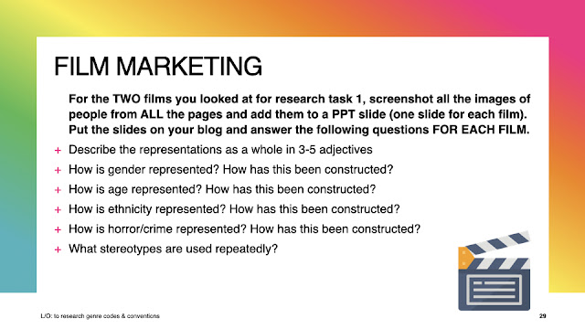
-How things are shown through the media
- how media texts deal with and present gender, age, ethnicity, national and regional identity, etc.
HORROR
1) you'd either get a long shot of the main villain/monster in the foreground of the image or a medium long shot of the main character as the main image. for the movie itself the saturation of the colour palette would be dulled down to create an eerie feeling, especially in older horror films due to the lack of technology
2) a dulled colour palette, consisting of red, black, grey and some other colours linking to the theme/plot of the film
3) most horror film will have a serif font, although it isn't odd for them to use some sans serif fonts also
4) in most cliche horror films, there will be a final girl– e.g. Sidney Prescott in Scream– but that sometimes isn't the case. the main villain/monster will want to seek revenge or do these harmful thing to people for fun. the characters in these movies will most likely follow the Propp's theory– the hero, the villain and the damsel in distress.
5) in these types of movies the killer will always have a motive for doing what they are, whether it be for fun or a deep rooted problem we'll find out throughout the movie. or the movie will be focus on the victim of the villain, showing them surviving despite the killer trying their best to kill them. horror movies will also normally be split into 3 acts– act 1 the threat makes their first appearance, act 2 the characters learn the meaning of the threat and begin to fight back and finally act 3 the final confrontation of the threat either ending in the characters surviving or dying.
6) horror films have a very diverse range of people– representing many different genders, ages, ethnicities, etc. the villain though is mostly represented as aggressive.
DO NOW-
- What features make a horror movie stand out to you?
- what is your favourite type of horror movie? (e.g. psychological horror)
L/O- to plan an effective product aimed at a specific audience using appropriate codes and conventions
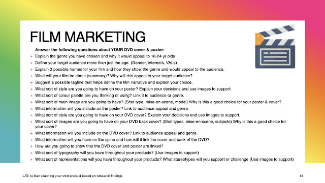
1) i have chosen horror as my genre and i think it'll appeal to 16-24 year olds because they are old enough to any horror movie rated 15 and above which is most horror movies
2)


No comments:
Post a Comment